
An exciting, explosive athlete is appreciated precisely because he or she is able to perform amazing feats within the bounds of the game rules.
 If you work for an organization that controls its brand expression through graphic identity guidelines, how do you know when it is time to vary from those guidelines or to change them outright? What is the life cycle of a design template, a logo, a font family or a color palette?
Every designer or brand manager has run up against that question, and the answer isn’t a simple one, but having spent many years in the branding business let me share three arguments for why graphic identity guidelines should have long lifespans.
1. Graphic Guidelines Harmonize Your Message
Consistent use of color, graphics, typeface and message content helps people quickly identify and more clearly understand your brand. When an organization uses different colors, layouts, graphic styles and messages from one communications material to another, it gives the impression of chaos and leads the consumer to wonder, “Who are you, really?”
When I took the job of communications director at McCombs School of Business, the first thing on my task list was to visit all of the department heads around the school. Dutifully, I collected business cards at each stop, and when I was done I had a collection that looked like this:
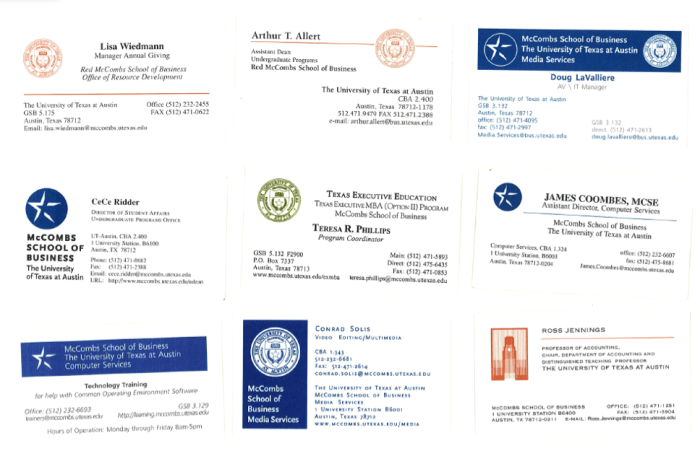
It was clear that while the school of business had many successful attributes, we were definitely not presenting a consistent, recognizable brand image to our audiences. Such things matter. In the absence of oversight and agreed-upon controls, individual brand decisions will interact to create design dissonance–even though each designer’s efforts might be defensible when viewed in isolation.
Design dissonance is a form of brand camouflage, and generally, consumers are in no mood to expend extra energy trying to decipher who you are, or why your image has changed. Your audience is hyper-distracted, so in each communication give them quick, consistent visual clues that telegraph the message, “Hey, over here, see us!” Trust me, you are doing them a favor.
2. Graphics Guidelines Become Tiresome First to You
Years back I was the creative director at an advertising agency. We had a stunning new ad campaign about which we were thrilled, so much so that we framed large posters of the ads, which our client hung in his office.
Three months later he announced to our surprised account executive that it was time to rethink the campaign. “It’s getting tired, we need something fresh and new,” he groused.
Only one problem, the campaign was just launching in magazines that month. Consumers hadn’t even seen the first ad yet, and it would take months before the ad exposure reached the desired level of consumer recognition. Our client had grown tired of a campaign that had never been seen by his customers!
Remember that your organization is not the center of your target audience’s world, and they are not immersed in your brand day-in and day-out. Your ads are not hanging like posters on their wall. Unless you are Google or Facebook, your audience is likely not visiting your website daily. They may catch a glimpse of your online advertising or social media campaign from time to time, but it is a hurried glance as they swim through the thousands of other messages and images they encounter each day.
In short, don’t change your brand expression because you’ve grown tired of the look. Your target audience is just starting to recognize you!
3. Graphics Guidelines Enable True Creativity
Consider the graphic identity standards utilized by Apple, Inc., a company whose products are widely dispersed across many potential audiences, from ubiquitous iPhones to high-end computers used by design professionals. With so many audiences and products, their marketing materials are always fresh, powerful and highly targeted to the individual product audiences.
 Through it all, the life cycle of typefaces at Apple has been measured in decades, not years. The Apple Garamond font was introduced in 1984 and used for at least 18 years, a time period in which Apple advertising was recognized as the best in the industry. Apple created a brand, not just a series of campaigns.
An exciting, explosive athlete is appreciated precisely because he or she is able to perform amazing feats within the bounds of the game rules. A talented designer working within a graphic identity system is able to focus on more meaningful methods of creative expression precisely because the design standards provide a court upon which to play.
This requires the creative team to have both the time and the resources (read that as money and team support) to write powerful headlines and messages, to create compelling graphic images, and to utilize imaginative channels of communication. Note, none of those elements are weakened by a well-crafted graphic identity system.
How to Decide When a Graphic Identity Change is Needed
No one would argue that an organization should never modify its brand expression. Be sure that discussion begins with the same careful consideration that preceded the creation of the original brand plan.
This article isn’t a protest against change, only a caution against diluting the power of your brand in order to gain short-term design satisfaction in a piecemeal approach, with new fonts and colors appearing like dandelions on your carefully manicured lawn.
A smartly designed graphic identity system is your customers’ friend, and properly used it will be a dependable and helpful marketing teammate.